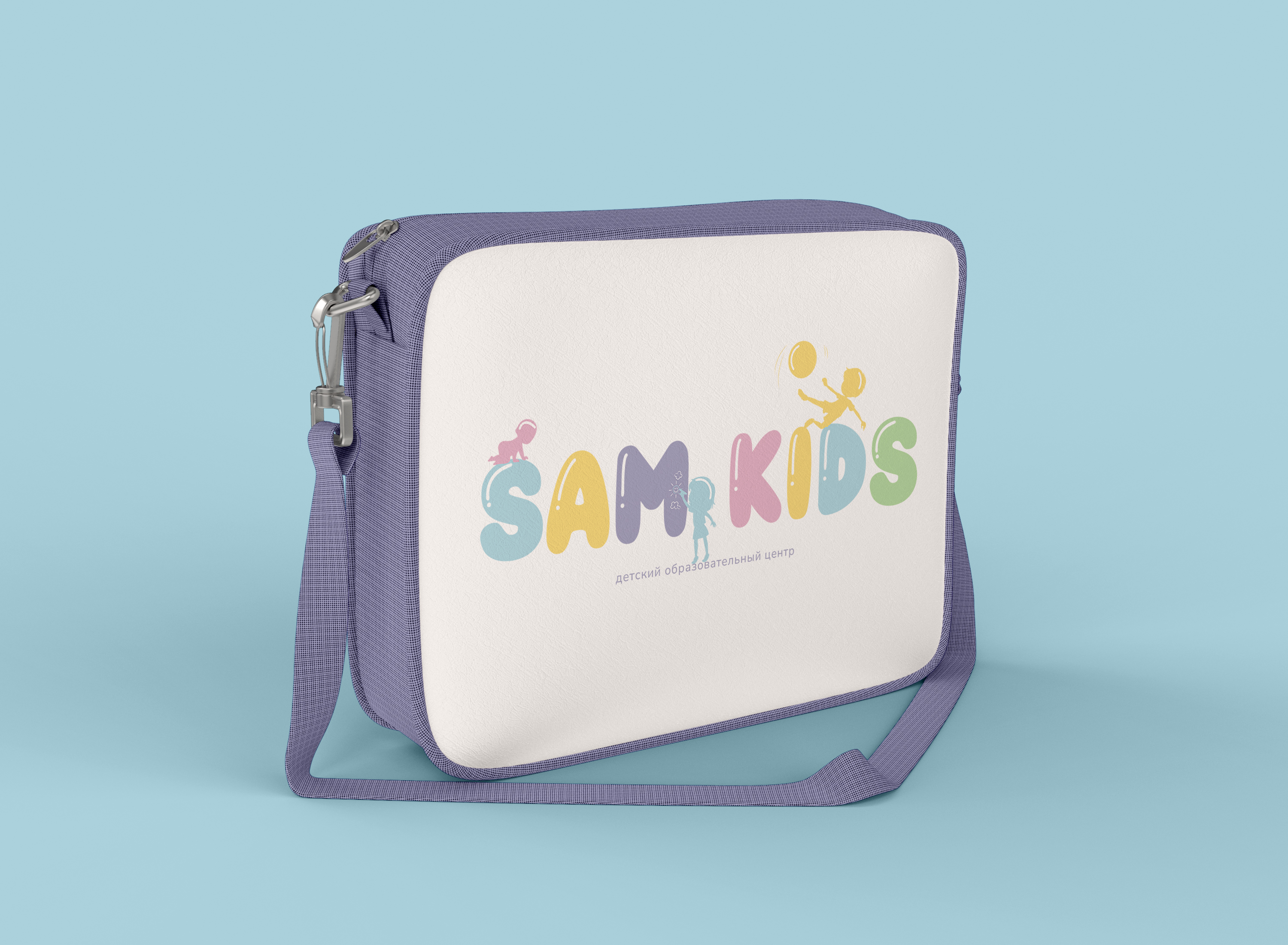
Client: Sam Kids Montessori School
Project: Brand Book Creation
Studio: A3M Studio
When Sam Kids Montessori School approached A3M Studio, they had a clear vision—to create a nurturing space where children could explore, learn, and grow freely. However, while their philosophy was strong, their brand identity lacked cohesion. They needed a visual and verbal identity that truly reflected their Montessori values, child-centered approach, and warm, welcoming environment.
That’s where we stepped in.
Our journey began with deep discovery sessions, where we listened to the founders' passion for education and their desire to create a school that fosters independence, curiosity, and creativity. We immersed ourselves in the world of Montessori—observing learning spaces, understanding the pedagogy, and capturing the essence of what makes this method so unique.
We knew the brand had to resonate with both parents looking for the best early education for their children and educators passionate about Montessori methods. So, we developed a narrative that blends warmth, trust, and professionalism, ensuring that every message from Sam Kids would feel both reassuring and inspiring.
Core Brand Message:
"A place where curiosity thrives, independence is nurtured, and every child’s journey is celebrated."

The Montessori method encourages hands-on learning, exploration, and creativity, so we designed a brand identity that embodies these principles:
✅ A logo that symbolizes growth & exploration – With soft, organic shapes and playful yet structured typography.
✅ A warm, earthy color palette – Inspired by nature, fostering a sense of calm and curiosity.
✅ Typography that balances fun & clarity – Ensuring materials are accessible yet visually engaging.
✅ Illustrations & imagery that capture real moments – Showcasing the joy of learning through discovery.

A brand isn’t just a logo or a color scheme—it’s the experience it creates at every interaction. We developed a comprehensive brand book that guides Sam Kids in maintaining consistency across:
🎨 Printed Materials – From brochures to admissions forms, ensuring a polished and engaging look.
📱 Digital Presence – Website and social media guidelines for a cohesive online experience.
🏫 School Environment – Interior branding and signage that reflect the Montessori ethos.

With their new brand book in place, Sam Kids Montessori now has a unified and compelling identity that speaks directly to their audience. The school’s philosophy shines through every detail—from the warm, engaging tone of their messaging to the inviting, nature-inspired visuals that make their brand feel like home.
More than just design, this project was about building a brand that reflects a lifelong commitment to nurturing young minds. And for us at A3M Studio, that’s what great branding is all about—telling a story that resonates, inspires, and lasts.
📩 Looking for a brand that tells your story? Let’s collaborate.